Breadcrumbs during no contact
Breadcrumbs during No Contact: 7 tips on how to handle the situation
Breakups are hard to deal with but when you experience breadcrumbing that feels like you’re going through separation anxiety for the second time.
Usually breadcrumbing starts when the dumper is beginning to deal with hurt and pain from the breakup. Your ex is trying to heal their separation anxiety by reaching out to you.
It’s such a complex period because you’ve just been dealing with the breakup and trying to nourish yourself. Now you find yourself in between reconnecting with your ex or not.
That’s why it is very important to make a distinction between e pure intention of reconciliation and breadcrumbing. Your ex might have different reasons for contacting you again and maybe they’re doing it intentionally or not.
You can draw a distinction just by testing your ex and knowing your position in this relationship.
What is breadcrumbing?
Breadcrumbing is any contact from your ex that doesn’t include the real meaning of reconciliation. It can be a simple emoji, texting, checking on you, commenting on your photos, or even “I miss you” type of message.
Here are a few versions of breadcrumbing that you might have been experiencing:
1. Your ex asks you for favors.
2. Your ex likes your pictures on social media.
3. They ask inaccurate questions or say something that doesn’t connect with the situation that you’re in
4. Sends any types of memes that are not related to your situation.
5. Improvising “heartfelt” text such as: “It had to be this way”, “Hey, how you doing”, “I’ve been missing you a lot”.
6. They act as nothing happened and reach out to you, but without any exact reason, that shows reconciliation.
7. Sends a simple text to check on you but then disappears for days. Finds it as a smooth way of ghosting you.
8. They act like they can pick up the relationship where they left off.
9. Does not request to talk about your relationship or how you can mend it.
10. Sending flirty texts but not required to meet you in person.
11. Being interested only in meeting you for a short fling.
12. Contacts you with a simple pretext such as: “I have been busy all this time, or how are you?”, “Been wanting to call you for some time”.
13. Your ex doesn’t outgrow their mistakes and never asks for your forgiveness.
Here are 7 tips on how to deal with the situation:
1. Define the source of breadcrumbing
Your ex might breadcrumb you with a specific intention or they might not be aware that they’re doing it.
That all comes from the source of pain and that’s the way that a dumper deals with the breakup, while they regret their decisions.
An ex might contact you because he is puzzled after the breakup and wants to check if there is a second chance for them.
On the other hand, they might contact you just to get their dose of boosting their ego and feeling better for themselves.
Note: Your ex might not go full speed to recover your relationship and to taste the waters you must take a glimpse at these details:
- Your ex might not apologize directly but will mention the things that they’ve done wrong and what they are trying to do to fix them.
- They might talk about their experience after the breakup but without making any negative comments towards yours.
- They take actions such as helping you, they’re vulnerable with you and intend to work on the relationship.
2. Know where do you stand in this relationship
Before answering to any type of breakup be sure to know your stance towards your ex.
If you’re not healed yet then it’s better to not answer to any of these breadcrumbs until you are all nourished.
On the contrary, if your feelings have changed then it is better to let your ex know politely how you feel about them.
Being confused about your relationship or about yourself and responding to breadcrumbs can leave you hurt and mixed up.
3. Let your ex know your boundaries
No matter if the breadcrumbing is made with an intention or not, it is better to have a transparent approach to your ex.
During the No Contact period, you have had the chance to take a step back and reflect on your relationship.
If you had a really bad breakup and your ex wanted to cut all ties with you but suddenly texts you “I really miss you” then if you don’t feel like reconnecting you might text back:
“Hey, that’s nice. Wish you the best.” This type of text will be simple, short, and polite to draw your boundaries.
This way you show your strength and that you’re not the same as you were at the beginning of the breakup.
4. Consider how this reconnection will impact you
During No Contact, you might wonder what if my ex doesn’t contact me but what if he does?
If reconnecting with your ex still makes you anxious or be in pain then it is better to not reconcile your relationship for some time.
Put yourself first and think about how you felt when you were being distant from your ex.
Your interaction might be short, sweet, and polite but the aftertaste will let you know about your future decision.
5. Be aware of the red flags that are still evident
Most of the time when a dumper wants to reconnect with their ex not due to pure intentions then they will sugar coat their mistakes.
If the dumper wanted to reconnect with you even if they were afraid of rejection then they would show that they have outgrown their mistakes, by their actions.
If your ex was afraid of commitment and texted you: “I want to be only with you.” out of nowhere then this is a sugar-coated text to point out that they’ve ‘changed’.
In this situation, if your ex doesn’t show with their actions that they have outgrown their mistakes then it is better to step out and continue with No Contact.
6. Don’t have a conversation without healing yourself
A dumper might reach out to you during different time frames of No Contact. It can be after two weeks, a month, or even more.
The moment you’re completely healed, you’ll know how to respond to their texts or their actions.
If you’re not quite nourished then you’ll make decisions based on the moment and not on what is the best for you.
Once you feel good with yourself then it is easier for you to respond to them and not be hurt or expect anything from them.
7. You can remove them from any mutual platform
If you feel that their actions are hindering your healing process then you can remove them from your social media or even block them.
That all depends on the type of relationship you had.
Breadcrumbing can be very bad for your emotional and mental health because it is a way of keeping you hinged.
If these actions make you confused then the best way to reflect is by muting or blocking your ex and focusing on yourself.
How do you know it is too early to respond to breadcrumbing?
Breadcrumbing is a way that an ex uses to trigger your consciousness and put them into your mind. Whether that is done with any intention or not.
You can know that is way too early to interact with your ex when:
1. You get way too excited to see that they’re writing back to you and you feel some type of numbness and confusion.
2. You have false hopes and have fantasized about your future.
One of the signs of not being healed after the breakup is not facing reality and always seeking to reconcile your relationship or be back with your ex.
3. You don’t feel safe and secure by yourself. You need your ex to make you feel better about yourself.
4. You haven’t been able to reflect on your relationship and never took a step back.
5. The breakup was bad but your ex asks you to be friends.
If your ex contacts you after a few weeks and asks you to be just friends then that is a clear sign of breadcrumbing.
The distance and breakup haven’t hit your ex yet and they can’t reflect yet properly on your relationship. Also, you are not healed yet and you’re still at the beginning of the healing process.
6. You rush immediately in reconnecting without thinking twice.
You take any comment, reply, or any post of your ex as a sign of reconciliation.
7. You just want to be loved again. After the breakup, you might lack self-confidence and that leads to not loving yourself properly.
Any act of your ex towards you will seem to you that they miss and need you in their life again.
8. You don’t pay attention to your ex ignoring you in mid-conversation.
When your ex is breadcrumbing you during No Contact they do it to get your attention and when they get it then it is their time to step back.
They do it either because they’re afraid of continuing with the relationship or they want to have some type of control over you.
If you find yourself in this situation then it is better to start all over with No Contact.
9. You get confused even more. Once your ex reaches out to you and you don’t know the reason or the answer to their questions then you’re not ready to respond.
10. You think of your ex’s text or interaction constantly.
If you don’t have the space to reflect properly towards your ex and make an accurate decision then you need more time to heal and reflect.
What happens when you don’t respond to your ex’s breadcrumbing?
Sometimes choosing to ignore the breadcrumbing is taken as a juvenile act but on the contrary that will make your ex reflect more.
~ The continual distance is important because you will test your ex’s interest.
If your ex is interested in mending the relationship then they’ll continue to maintain a correct way of communicating. They’ll try to
~ You won’t be part of their mind games and if they can’t have control over you, they will either start to reflect or cut ties with you for good.
~ You give yourself and your ex some time to accept your feelings and decide how to respond.
Not responding to breadcrumbing will show resistance and maturity too. You will give time to your ex to heal completely from the breakup too and decide what’s best for you.
~ You will be able to tell that you’ve gained self-confidence and all the power to be by yourself during No Contact.
Scarcity and maturity will attract your ex if they want to reconcile things with you.
~ Now you decide on your own if you want to start a relationship with your ex.
If you are completely healed and you don’t respond to breadcrumbs now you’re in control of your future relationship.
The bottom line: Is breadcrumbing harmful for me?
Yes, breadcrumbing can be very harmful when you’re not healed and you still have expectations from your ex.
Giving you mixed signals can hinder the process of healing and make you experience the same pain as at the beginning of the breakup.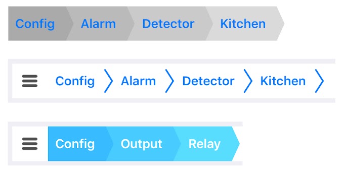
To avoid making any mistakes that might lead you into hurting again, find out the reason why your ex has contacted you and if they really mean it.
If you don’t feel like reconciling the relationship then according to your breakup and interaction you might choose to ignore them or answer politely.
Loneliness strikes both your ex and you but in different forms. Test the waters before making any instant decision.
Show the strength that you’ve gained during No Contact and choose what makes you better.
Warm hugs,
Callisto
Getting Breadcrumbs During No Contact (3 Reasons Why)
3 reasons why it happens and what you should do:
1. Breadcrumbs during No Contact are usually the most a woman will do to show you that she’s interested in getting back together
Most guys who decide to use No Contact to get an ex back, don’t realize that getting breadcrumbs from her during this time can actually be a good indication that she still has feelings for him and wants him back.
Instead, a guy like that may end up wondering things like, “What does this mean? Is No Contact working or not? What do I do now? Should I break my silence and call her, or should I just continue ignoring her until the full 30/60 days are up?”
Here’s the thing though…
If you’re using No Contact as your primary method of getting your ex back and she reaches out to you (even if it’s only a text here and there to say hi), accept that she’s giving you a green light to let you know that it’s still on between you and her.
When she sends her signal, it’s then up to you as the man to follow through on the ex back process and do what needs to be done to fully reactivate her sexual and romantic feelings and get her back.
The fact is, regardless of how much a woman misses her ex during No Contact and wants him back, giving him breadcrumbs is usually the most she will do to reopen herself up to him.
She almost always won’t make it overly obvious to him that she still has feelings for him and wants him back, because she’s worried that he might turn around and reject her.
This is especially true if he’s been using No Contact on her.
As a result, she will just send him small hints that she’s open and wait to see how he responds.
If he just ignores her, she will take it as a sign that he’s over her and possibly that he’s even moved on.
She will then force herself to get over him too, usually by meeting, hooking up with, dating and getting into a relationship with a new guy.
Of course, from his point of view, he’s just doing what he thinks he’s supposed to do to get her back (i.e. ignoring her for the full 30 or 60 days).
Unfortunately though, by not picking up the breadcrumbs she’s throwing him, he ends up losing her for real.
He will then likely say things like, “I don’t get it. What went wrong? I did everything according to the rules. Yet, in the end, I lost her anyway.”
Yet, here’s the thing…
If you want your ex back, don’t mess around playing mind games with her – especially if you’ve been getting breadcrumbs during No Contact.
Just take that as a sign that she still has some feelings for you and show her that you’re man enough to take the lead in the ex back process.
So, don’t hesitate any longer.
Call her on the phone today and start re-sparking her sexual and romantic feelings for you (e.g. by making her laugh and smile and feel happy to be talking to you again, flirting with her to create a sexual spark between you, being confident regardless of what she says to put you off) and get her to meet up with you in person.
Of course, before you get to the meet up make sure that you’re prepared to give her an upgraded attraction experience to the one she got before.
In other words, don’t get there and say and do the types of things you did before that she got tired of (e.g. being too nervous and insecure around her rather than being confident and sure of yourself, being too nice and treating her like a neutral friend rather than being more emotionally masculine so she feels feminine and girly in your presence).
The more you think, act, behave and respond to her in ways that are attractive to her, the more drawn to you she will feel again.
Additionally, she will feel respect for you for picking up on her hint (i.e. the breadcrumbs she threw your way) and being man enough to follow through on that (i.e. contact her, re-spark her feelings on a call and then get to a meet up).
As a result, her defenses will naturally come down and she will open back up to being in a relationship again.
From there, all you need to do is remain confident, fully reactivate her sexual and romantic feelings for you and get her back.
Another reason why this happens is…
2. Breadcrumbs during No Contact are sometimes just her feeling bored and texting or contacting you in some way out of habit
Sometimes a woman will be sitting around feeling bored (e. g. on a Sunday evening, at the office, while stuck in traffic).
She may then start thinking about how she hasn’t heard from her ex in a long time and wondering things like, “I wonder what he’s up to. I haven’t had a single call, text or message from him in days/weeks/months. Maybe I should send him a quick text to say hello and see what happens.”
As far as she’s concerned, it likely doesn’t mean she wants him back or anything like that.
It’s simply her way of reducing her boredom, while at the same time indulging her curiosity.
However, that doesn’t matter.
What matters is that she’s given him an opening to begin sparking her feelings for him again so that he can get her back.
So, don’t waste the opportunity if your ex is throwing breadcrumbs your way during No Contact, regardless of what her reasons for doing it might be.
Instead, use it as a chance to show her that you’ve leveled up as a man and can now make her feel attracted in new and exciting ways.
For example: Imagine that you get your ex on a phone call with you.
Chances are high that she’s going to be expecting you to be nice and sweet and have a normal conversation with her about what you’ve been doing all this time you haven’t been contacting her.
She’s likely thinking that she’s going to have a predictable conversation with you, pacify her curiosity and then hang up the phone with you and go back to the way things were before.
Of course, that’s not what you want.
You want to re-spark her feelings so she wants to be your girl again.
This is why, instead of being predictable, you use some humor to spark her feelings and make her feel curious about your newfound confidence.
For example: Let’s say she texts you something along the lines of, “Hey, stranger, how have you been?”
Rather than responding in the way she’s expecting you to by saying something like, “I’m fine. Just been really busy with work. How are you?” you instead respond in a joking way.
Remember: It’s not about cracking pointless jokes with her, but rather about sparking her feelings of respect and sexual attraction.
That’s why, a good response might be something like, “Sorry, I don’t recognize this number. Do I know you?”
She might then respond with something along the lines of, “It’s me, Vanessa.”
You can then reply with, “Hey there ex girlfriend. How you doing?”
Note: If she doesn’t reply by telling you who it is within a few hours, just reply with something like, “Just kidding Vanessa. Lol…we can still joke around right? How are you anyway?”
She may then begin thinking something along the lines of, “That’s not at all how I was expecting this interaction to go. I thought I’d just have a quick catch up with him to see what he’s up to, but instead, I encounter a new guy from the one I broke up with. He sounds so different now. He seems more confident now. I know I just texted him because I was bored, but now I want more. ”
”
She will then naturally drop her defenses and open up to speaking with you on a call, or meeting up in person.
You can then call her and arrange a meet up, so you can then fully reactivate her feelings and get her back.
Another reason why this happens is…
3. Breadcrumbs during No Contact are sometimes her way of checking that you’re still interested, so she can move on without feeling like you’ve rejected her
In some breakup cases, a woman will hate the idea of her ex finding a replacement woman and moving on before she’s had a chance to hook up with a new guy first.
So, if she hasn’t heard from him in quite a while (i.e. because he’s using the No Contact Rule to try and get her back), she might begin to worry that her fears have come true.
So, to ease her mind, she will try to find out what he’s up to by sending him a casual text to say “Hello” and see how he responds.
If he quickly replies with something along the lines of, “Hey. It’s so good to hear from you. I’ve missed you,” she’ll know that he still has feelings for her and she will feel better about herself.
She will then put in extra effort to move on and find a new man, knowing that her ex still wants her.
On the other hand, if she discovers that her ex is the one who is moving on first, she will feel hurt and like he’s leaving her behind.
This is a good thing.
It makes her feel drawn to him again (i.e. because women naturally feel attracted to guys who are wanted by other women), which causes her to drop her defenses and open back up to talking to him over the phone and seeing him in person.
He can then easily reactivate her sexual and romantic feelings for him (e.g. by using humor to make her feel happy to be around him again, flirting with her to create sexual tension, making her feel feminine and girly in his presence) and get her back.
This is why it’s so important that while you’re using No Contact to get your ex back, you’re not sitting around feeling sad and lonely.
You’ve got to use the time apart to focus on the other important areas of your life (e.g. your goals and dreams).
You need to show her that even though you and her have broken up, you’re not sitting around feeling sorry for yourself.
Instead, you’re living your life and having fun without her.
Of course, that doesn’t mean you don’t want her back, it simply means you don’t need her back.
Then, the next time you get breadcrumbs from her where she asks about what you’re up to, you can call her on the phone and have a nice catch up chat with her.
Then in conversation (without actually rubbing it in her face or making her feel bad), you can tell her how you’ve been pursuing your big goals in life and are happy, confident and forward moving in life without her.
When she finds out that you’re so much more emotionally mature and independent than you were before, she won’t be able to stop thinking about you in a more positive way.
When that happens, she opens back up to talking to you and seeing you in person and you can easily reactivate her feelings for you and get her back.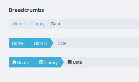
Want Her Back FAST?
Watch a secret video by Dan Bacon where he reveals the fastest way to get your ex back.
It's only available here. Enter your email below to watch the video for FREE right now.
Simply enter your email address and click the orange button to gain free, instant access!
"Breadcrumbs": micro-markup and its impact on page snippets
Home / Articles / “Breadcrumbs”: micro-markup and its impact on page snippets
Articles
31.08.2015
Author: Oleg Frolov
“Project manager of the Business Motor team, webmaster, copywriter.
Breadcrumbs are useful for users and search engines. Micromarking makes it easier for the user to navigate the site and is used by search engines to form an extended snippet. We tell you what's what"
Even very strong ranking successes can be offset by unattractive low CTR snippets. Conversely, an interesting, motivating snippet can make a site stand out from the rest even if it is not on the first lines of search results. It is for this reason that any opportunities for expanding the snippet can and should be used to the maximum. One of these is “breadcrumb” markup, which allows you to show the rubric to which the material belongs in the search results in a readable and understandable way for the user.
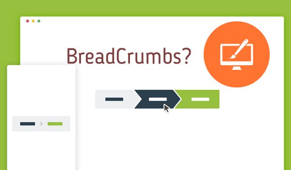
What are breadcrumbs?
Breadcrumbs is a common name for a navigation chain that reflects the path to a given page of the site, taking into account the structure of categories and subcategories. It may look something like this:
For the site user, "breadcrumbs" are convenient because they allow you to quickly return to the heading or subheading to which the material belongs, and also to easily navigate the site structure. But no less important is the importance of the navigation chain for SEO, because it can be designed using micro-markup with subsequent changes in the snippet. How to do this - read below.
What does a featured snippet look like?
Let's illustrate the snippet on the example of a specific site before and after applying breadcrumb markup.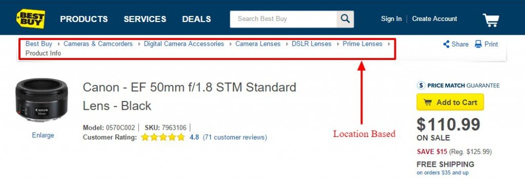 This is how a typical Google book review snippet looked like earlier:
But this information appeared in the search results after the markup was implemented and the page was re-indexed by the search engine:
rubrics helps the user quickly assess the genre of the book, which means getting more information about the page and making an intelligent choice. In the case of online stores, this also helps to determine at a glance the category of the catalog to which the product belongs. In combination with product micro-markup, the semantic design of breadcrumbs allows you to get the most complete, information-rich product snippet, which will surely not go unnoticed by the user.
Breadcrumb markup in Google and Yandex
It should be noted that the extended snippet in terms of the navigation chain in Google and Yandex has certain differences that should be taken into account. So, in particular, if the use of “breadcrumb” markup (provided there are no errors) will almost certainly be reflected in Google’s search results, then this cannot be guaranteed in Yandex.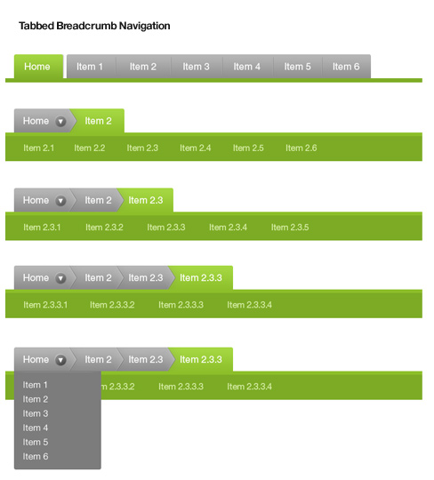 Yandex.Webmaster provides the following explanation for this:
For large sites with a well-defined structure, a navigation chain (a number of links to sections of the site to which the found page belongs) can be displayed under the snippet. Such a chain allows you to quickly assess the amount of information on the site or the type of content, and, if necessary, go to the desired section in one click.
Of course, the evaluation of the “expressiveness of the structure” is left to the discretion of Yandex algorithms, so the snippet in the search results of this search engine may not change, despite the introduction of microdata.
Another observation is also interesting. In the extended Google snippet, the heading is pulled up in strict accordance with the navigation chain marked up on the site. At the same time, Yandex can ignore “breadcrumbs” altogether, and show the structure according to the url-address (even if there are more or less levels in the real marked-up navigation chain).
With all the features of the extended snippet for categories, Yandex also provides additional bonuses from its use. Heading names in its search results are clickable, i.e. instead of a specific product or article, the user can go to the part of the catalog and heading that interests him.
Google displays category titles in plain text and is for informational purposes only.
How to use breadcrumb markup?
There are several standards that allow you to markup the navigation chain, and all of them are equally supported by both Yandex and Google. Among them are OpenGraph, RDF, Schema.org and microdata. Each of them has no significant advantages, so you can use the one that is more understandable to the site administrator or layout designer.
As an example, let's take breadcrumb markup using data-vocabulary.org RDF markers. To do this, enclose the entire navigation chain in the 
Heading levels should be enclosed in the tag … , and two additional attributes should be added to each link in the breadcrumb rel="v:url" property="v:title" .
For example:
More about micro-markup of the navigation chain can be read, in particular, in the Google instructions for developers.
After micro-markup is implemented on the site, it is advisable to check its correctness using the Google and Yandex validation tools. In the event that no errors are detected during the check, the results can be expected in the search results within 1-4 weeks - as the site is re-indexed by search engine robots. In practice, this period depends on the regularity of the robot visiting your site and the frequency of updates to search engines (the latter applies primarily to Yandex).
Conclusions
Breadcrumb markup allows you to display in a snippet in a readable form information about the categories and subcategories of the site to which the page belongs. This helps the user to better navigate the structure of the site and the ownership of a particular material.
Both Google and Yandex support micro-markup of the navigation chain, but with their own unique differences that must also be taken into account.
Semantic breadcrumb markup can equally well be used with OpenGraph, RDF, Schema.org, and microdata standards.
Related articles
Articles
How to optimize old content
In the 21st century, information loses its relevance instantly. New content is important to the site. He p...
08/26/2015
Articles
Site indexing: basic principles
Website indexing is important. Since it is in the process of scanning the site by search robots. ..
..
09/02/2015
new
article
What is brand digital maturity, why is it needed and how can a company “mature”
Modern technologies increase the demands of users on brands. Customers want answers...
Tricks of the mind that reduce work efficiency
Why do promising ideas fail in practice? Why employees don't fulfill deliveries...
7 recommendations for business optimization
Not every business is successful, not every service or product is in demand on the market. Every year we see a thunder...
Subscribe to the newsletter
Practical recommendations for website optimization, conversions and sales:
Leave Blank:Do Not Change: Your email:
popular
articles
11 Principles That Effectively Increase Conversion Rates
Pip Laja, Master of Conversion Optimization, offers a checklist of 11 principles that are guaranteed to. ..
..
How to increase brand awareness
Why care about brand awareness? And what is it anyway? Brand awareness is the level...
Website promotion in several regions: option No. 1
Username
Comment
Username
Your question
Create effective breadcrumbs for mobile devices
The item's name is a reference to the German fairy tale Hansel and Gretel, in which children scattered breadcrumbs in the woods to find their way home.
Through extensive usability testing, we have found that breadcrumbs play an important role on mobile sites for two reasons:
- The current location of users in the site hierarchy is much less obvious due to the fact that the main navigation is usually hidden.
- Navigating a site through the main menu on mobile devices is often more effort than on desktop, where the main navigation is always visible, and users can access categories—and even subcategories if they appear on hover—with a single click.

However, our latest comparison study shows that on 36% mobile product pages breadcrumbs do not reflect the full category hierarchy . Because of this, users do not always understand exactly where they are on the site, and it is more difficult for them to navigate it.
Users end up feeling lost and don't know how to find the product they want.
In this article, we will talk about the results of our research and how best to implement breadcrumbs on product pages:0180
The Problem of Incomplete Breadcrumbs
Fitting a complete breadcrumb on a small screen of a mobile device is a difficult task .
👎🏻 Product page on the website L.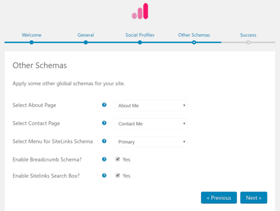 L.Bean : there are no breadcrumbs here. Such decisions should be avoided.
 The most unfortunate approach of is the complete absence of breadcrumbs. You shouldn't do this whether you're building a mobile or desktop version of your site.
Indeed, testing has shown that breadcrumbs are very important, especially for mobile device users . They help you understand which part of the site people are in and also give them access to additional levels of the hierarchy.
However, 20% of desktop and 65% of mobile product pages do not include breadcrumbs at all. This greatly limits the ability of users to navigate the site and navigate through its sections.
👎🏻 During testing, the user went to the product page on the mobile site Macy's via an external link. She wanted to browse other lipsticks, but the "Lipstick" subcategory was not present in breadcrumbs (first image), so she opened the desired section via the menu (second image).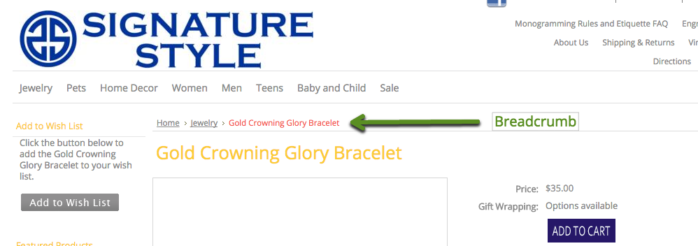 Fortunately, the main navigation makes it easy to move up the hierarchy. The absence of the current section in breadcrumbs - especially when there is enough space on the page - distorts the perception of the structure of the site and requires unnecessarily more effort from users when moving through pages.
 An alternative approach identified during testing is to exclude certain levels of the hierarchy from the navigation chain to reduce its length.
However, the absence of key hierarchy levels in breadcrumbs can confuse users as to how the site is organized and where they are. The result is a disorienting and overly laborious shopping experience.
When breadcrumbs do not include all major categories and subcategories, it is increases the risk of incorrect navigational decisions because users are unaware that the options that are visible do not reflect the full structure of the site.
As a result, users who want to see other relevant products may accidentally move to a higher level in the hierarchy than they intended, after which they will have to return to the desired section. Such navigation becomes too complicated and takes a lot of time .
Another how to adjust the length of breadcrumbs on mobile devices - display only the parent category or subcategory to which the product belongs.
For example, " Furniture " or " Sofas " instead of " Furniture > Living Room Furniture > Sofas " on the product details page.
Breadcrumbs that include only the current section reinforce the habitual “take one step back” behavior of users. However, this pattern creates certain problems .
For example, displaying only the parent subcategory gives users a very limited idea of where they are in the hierarchy, and prevents them from understanding what the category structure is and how products are generally classified.
Although this solution reduces the risk of errors when users try to move up the hierarchy, it severely limits their ability to move up only one level at a time .
These issues are particularly detrimental to the experience of users who arrive at a page non-linearly (for example, through internal or external search results, or from ads) because they don't have to navigate the hierarchy at all to get to the page.
An even more detrimental consequence is ambiguity : users don't know where a particular link will take them. Will it return them to the parent subcategory? Will all applied filters and sorting settings be saved?
In any case, the behavior of will never be 100% consistent with the expectations of all users, which will lead to disorientation and frustration for some of them.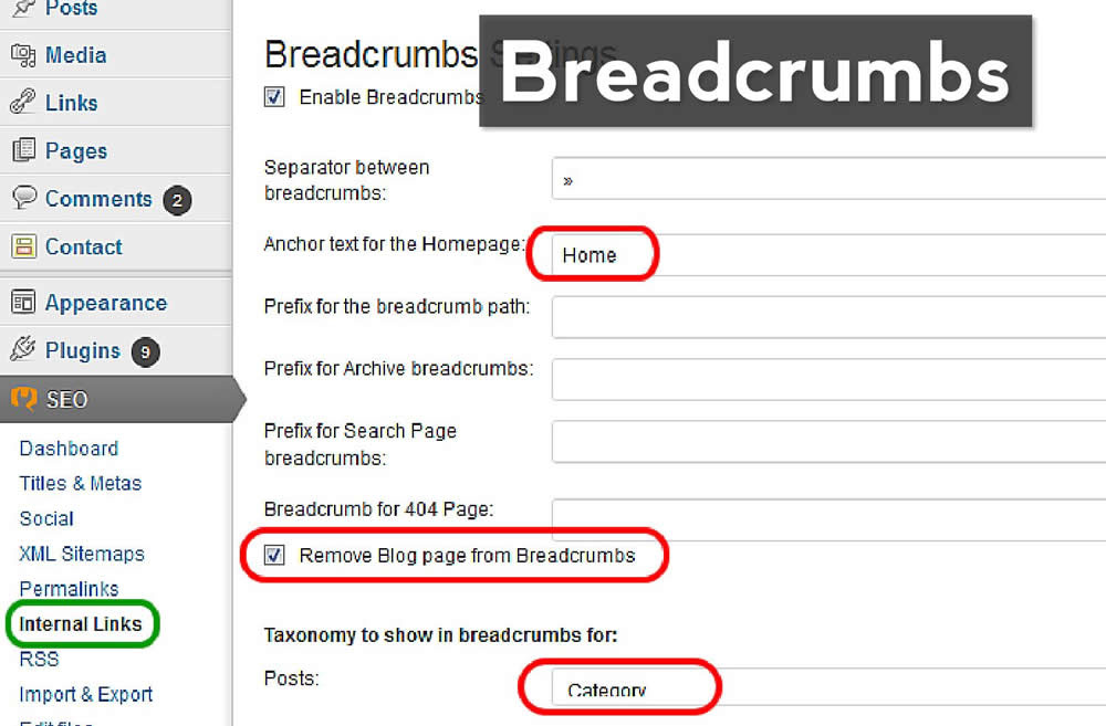
Therefore, at a minimum, add 9 to the breadcrumb trail0068 all key levels of the hierarchy, and ideally the full path to the current product.
Remember that it's hard for users to remember where they are all the time, especially when it comes to a mobile site. The lack of a full breadcrumb navigation on the product page makes this even more difficult - and when people feel they are lost or that it will be too difficult to find a product, some of them leave the site altogether.
2 ways to avoid overly long breadcrumbs
Many sites do not display the full breadcrumb on the product page because it is too long.
Our test showed that there are 2 ways , which will help you create bread crumbs of adequate length:
- Avoid excessive categorization of
- Exclude links to the main page and product page
1. First of all, avoid over-categorizing because it unnecessarily increases the length of the breadcrumb.
Do not rush to remove unnecessary subcategories from breadcrumbs. Review the product hierarchy for excessive categorization (perhaps options that should be filters are erroneously implemented as categories). It is for this reason that extra levels of hierarchy and, accordingly, breadcrumbs usually appear. Over 50% of e-commerce sites suffer from over-categorization.
In addition, look at the category names and see how they can be shortened or simplified. Make sure all captions are unique and informative, yet concise at the same time - this will allow users to quickly scan items and navigate to products of interest to them.
👎🏻 Eliminate links to the home page and product page . The breadcrumbs on the site HP include links to the home and current pages. As a result, it turned out to be too long. 👍🏻 The breadcrumbs on the site American Eagle do not include either the main page or the current page. Through testing, we found that excluding these elements did not adversely affect the user experience.
 2. Exclude links to the home page and product page from the breadcrumb . This is a logical step towards reducing breadcrumbs on mobile devices.
To get to the home page, users can click on the brand logo at any time, which remains visible on most mobile sites. Eliminate the link to the product page - usually the longest part of the breadcrumbs - drastically cuts them and reduces clutter at the top of the page.
Testing has shown that the lack of links in breadcrumbs to the main and current pages does not negatively affect the user experience .
How to implement a long breadcrumb navigation
During testing, we identified one design pattern that should be addressed if breadcrumbs on a product page remain too long even after the hierarchy and category names have been analyzed and corrected, and links to the main and current pages are excluded. Solution - add the ability to scroll breadcrumbs .
👍🏻 "I think it's nice to have a chain like this on the site because you can see the path you traveled to get to a particular product," one user of Overstock commented while scrolling through the breadcrumbs . Displaying all categories in the breadcrumb—and being able to scroll through them when they go outside the viewport—gives users an idea of their location and access to the full hierarchy.
Adding horizontally scrolling breadcrumbs to your site saves space and provides access to the full or near-full hierarchy with a standard gesture that testing has shown feels natural and familiar
to most users. With this approach, it is important to make sure that the intended interaction is absolutely clear .
When the beginning or end of one of the breadcrumbs is cut off by , users are able to tell in seconds that they can swipe left or right to access additional levels of the hierarchy. Sites with these breadcrumbs performed particularly well during testing.
Be careful with wrapping and skipping breadcrumbs
Let's look at 2 additional patterns for designing a full breadcrumb. However, they are only suitable for sites with a shallow hierarchy, and should be used with caution: Sites TigerDirect and Northern Tool full breadcrumbs are carried over to the second line, even after changing the product name to a much shorter product number. With this approach, care must be taken to ensure that the size of the breadcrumbs and the distance between them remains sufficient.
1. Move breadcrumbs to the second line . This approach is effective for sites with shallow hierarchies, since the actual number of times a migration is needed is likely to be minimal here.
However, the effectiveness of breadcrumbs on mobile devices is greatly reduced if users cannot easily click on them - wrapping links to the next line greatly increases the risk of errors when individual elements and the distances between them are too small.
The minimum touch area for mobile devices is 7x7 mm and the spacing between elements is 2 mm. Of course, to fit all this on the screen is quite difficult (but possible).
In addition, transfer of links to the second line overloads the top of the page, making it harder for users to distinguish breadcrumbs from other elements and easier to skip.
Thus, this solution is relevant only for sites with a shallow hierarchy, where the probability of transfer is low.
Hiding intermediate levels of the hierarchy. On the site REI the intermediate breadcrumbs are hidden and replaced by an ellipsis (first image). When pressed, they open (second image). Although displaying the appropriate top-level category in addition to the parent one increases user awareness of the overall structure of the site, this approach can make it very difficult to interact with the interface.
2. Hide intermediate hierarchy levels . By visually hiding intermediate links with ellipsis, we inform users that there are additional levels of hierarchy without taking up extra screen space.
At the same time, with this approach, we:
- rely on users to notice the small ellipsis,
- assume that they understand what kind of interaction is needed to open intermediate links, and
- we require certain actions from them only so that they can understand the depth of the hierarchy and determine their current position in it.
In other words, by hiding intermediate breadcrumbs, we shift the responsibility to the user , thereby increasing the likelihood that some will miss, overlook, or otherwise ignore the breadcrumbs.
Moreover, a breadcrumb trail with hidden intermediates risks does not meet the expectations of users if, by clicking on the link, they simply see all levels of the hierarchy, and do not navigate to the corresponding list of products.
In this case, users will have to do twice as much effort as , because they need to double-click on the default visible item in the breadcrumb to get to a particular section.
2 additional marketing tips
No matter how breadcrumbs are marketed, they can still is easy to get lost on a mobile screen if is not uniquely styled, of sufficient size, and not far enough away from other page elements.
During testing, some users had difficulty finding breadcrumbs on the product page , which increased the effort and time required to navigate to other offers of interest to them. When users don't notice breadcrumbs, navigation becomes less intuitive and more time-consuming.
To prevent this problem, there are 2 things to consider:
- Avoid piling up breadcrumbs and other elements at the top of the page
- Provide compelling visual cues that indicate interactivity of breadcrumbs
1. Avoid piling up breadcrumbs and other elements at the top of the page. Finding breadcrumbs on a product page can be difficult if there are certain similar style elements too close to them.
Clutter prevents users from quickly distinguishing one element from another, increasing the likelihood that some elements will go unnoticed.
Therefore, the decoration of the breadcrumbs should be unique , and the negative space around them should be large enough so that they don't get lost on the page.
👎🏻 Provide compelling visual cues indicating breadcrumb interactivity . Having got to the product page via an external link, this site user B&H wanted to see other headphones. He skipped the breadcrumbs (first image) and instead used the main menu (second image) to navigate to the Headphones product listing, which increased the number of taps to navigate to the desired page. Note that the breadcrumbs are not underlined, and the separators between them are almost invisible. Mobile users are more likely to miss such elements if they don't feel interactive. 2. Provide compelling visual cues that indicate the interactivity of breadcrumbs . Unlike desktop users who see tooltips in the form of an underline or color change when hovering over a clickable element, mobile users do not have this visual feedback.
Weak visual cues force them to click just to see if a particular element is clickable, which can lead to wasted effort and frustration. Some users may even develop a habit of completely ignoring links that don't look clickable. As a result, they miss out on valuable information and take a lot of extra steps to get access to the product or content they are interested in.
Therefore, it is extremely important to design breadcrumbs in such a way that it is very clear to mobile users that they can actually be clicked on.
Underscores and standard delimiters, such as ">" or "/", between hierarchy levels make them look like clickable links, and also visually distinguish them from other text elements on the page, increasing recognition.
Help users understand and access site hierarchy
👍🏻 User Target quickly found breadcrumbs on the product page for men's sneakers (first image) and used them to navigate up the site's hierarchy and navigate to the sister category "Women's shoes" (second image). Since the links are distinct from other elements on the page, and there is enough free space around them, they are not lost. By default, on mobile devices, breadcrumbs are displayed with an underline, which visually enhances their clickability.
 If breadcrumbs are difficult to find or do not provide access to the full navigation chain, this defeats their primary purpose to quickly inform mobile users where they are and enable them to navigate to higher levels of the hierarchy in one tap to explore other related products or related categories.
In testing, users were generally more successful with complete or near-complete breadcrumbs. However, according to our comparative study 36% sites do not display the full hierarchy inside breadcrumbs. (And 65% of sites don't include breadcrumbs at all on mobile devices.)
In addition to keeping breadcrumbs from being too long, it is important to
1) avoid over-categorization and
2) exclude links to the home page and product page from the navigation chain.